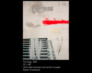
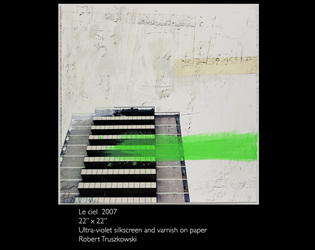
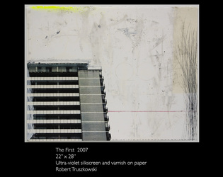
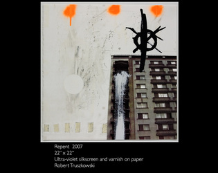
Selected work 2000-2017
Please click on images to see larger versions.
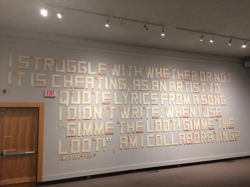
"AM I A RAPPER?" UV silkscreen on foamcore (Art Gallery of Regina Installation 2017)
AM I A RAPPER? - Project Description
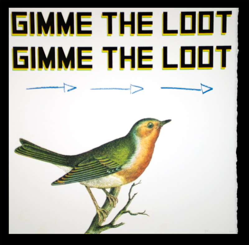
I struggle with whether or not it is cheating, as an artist to quote lyrics from a song I didn’t write. When I use “gimme the loot!”, Am I collaborating? Am I a Rapper?
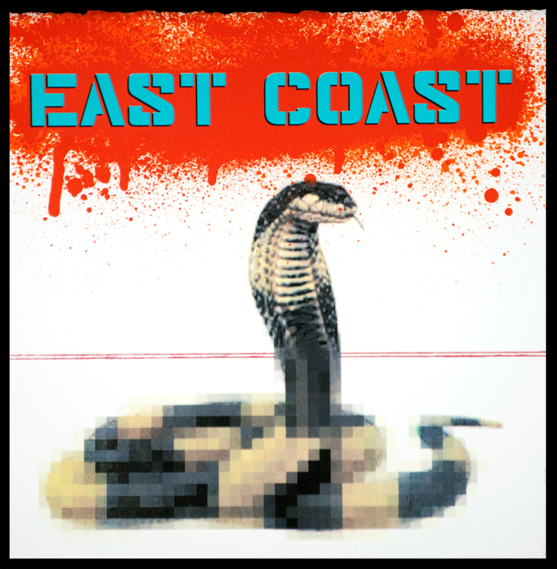
This project gave me the opportunity to test my assumptions first put into place in the Warning project (below). I had produced hundreds of individual letters, screenprinted with dozens of layers of translucent ink, and I was asked to reconsider a large wall at the Art Gallery of Regina for an exhibition entitled "Gunpowder". This piece is meant to be humorous, of course, but it is alto also deeply introspective. As an artist who has sampled from contemporary culture since the time of my earliest university education, this question, or a version of it, has been with me all along the way. Part of me wonders if my interest in rap music of the 1980s and 90s, a time when I was young kid, and later a teenager, influenced me much more deeply than I let on. During the days of the east coast/west coast rap wars, one of the main distinguishing factors between the music of the time and everything that had come before, was the intensive use of sampling. Musicians and producers held no punches, as they used catchiest beats and hooks in all of their songs. Albums produced by Sean "Puffy" Combs were almost guaranteed to succeed, because people were hearing parts of songs that had reached number one on the music charts in decades past. Closing this conceptual circle, my approach to sampling words and images is not dissimilar to contemporary students, and the ways in which they approach (internet) memes. I created (and create) work that was deeply embedded in popular culture, and as a result, sampling has become one of my most tested, and useful methods in the studio.
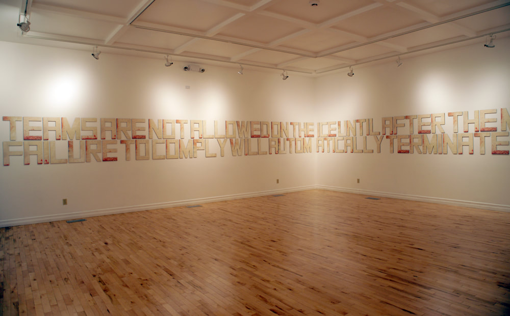
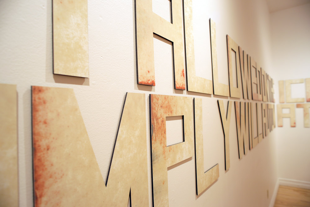
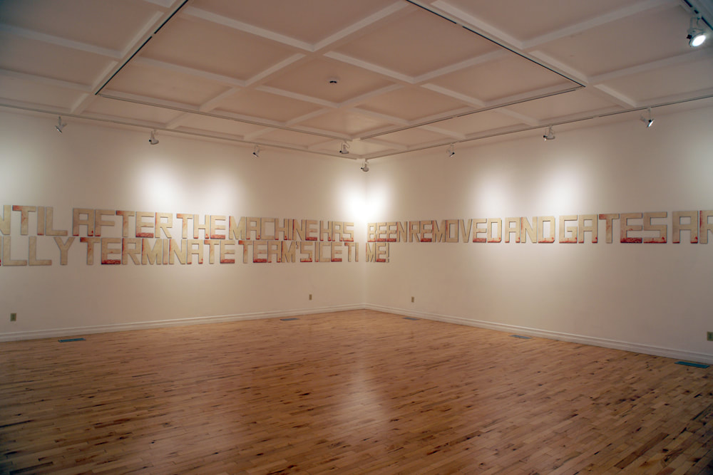
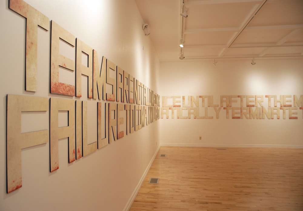
"Warning" UV silkscreen on foamcore (Elsie Scherle Gallery Installation 2016)
Warning - Project Description
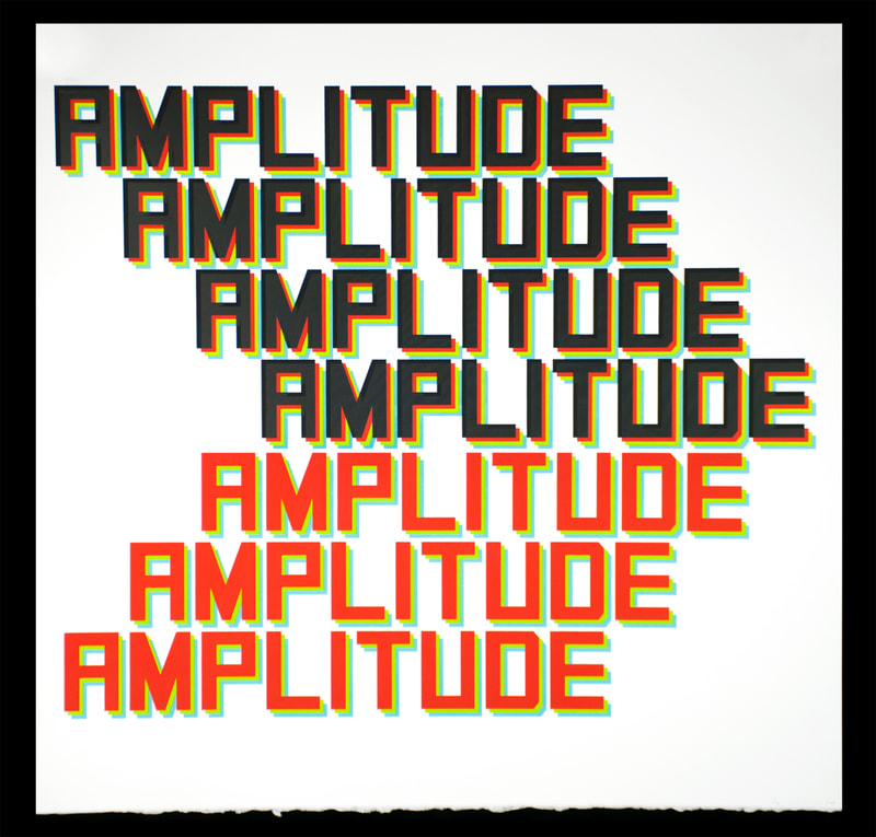
I first saw this phrase, meticulously, if a little "wobbily" hand-painted onto a sign at an arena in Regina when I was bringing my son for skating lessons. I was struck by the gesture... someone (not a sign-maker, nor a calligrapher) had felt strongly enough about this topic, that they decided to create a permanent sign. I imagined a series of hand-written paper notices taped to the wall, to which hockey players or figure skaters had paid very little heed. Now, something deeply-felt and personal would have to be done. There is a "fed-upness" to the language... or at least that's how I see it. It stuck with me for a while because at the heart of it, I am always drawn to how and why and what we choose to (attempt to) communicate to others, and in particular, to the place of words and text in the equation. I have, in fact, produced almost 400 letters (though only 150 or so are needed here), because I intend to configure or reconfigure other phrases, for other installations. In the same way that a typographer would, or still does(!) mine their type cases for all the individual sorts they need for a particular word, line, phrase, or page, I too have created my own "drawer" of type.
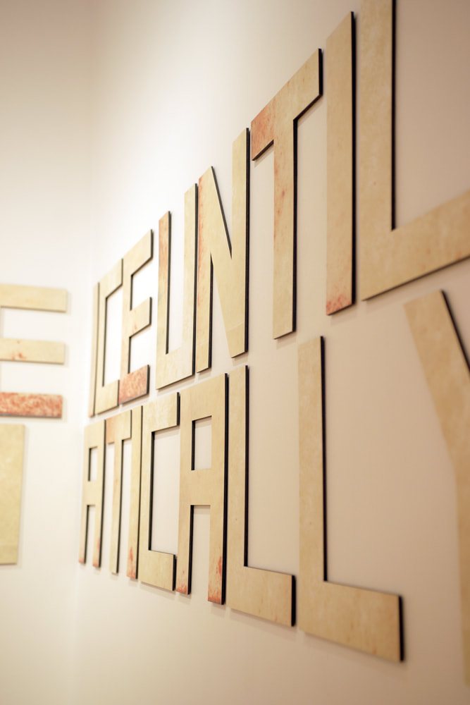
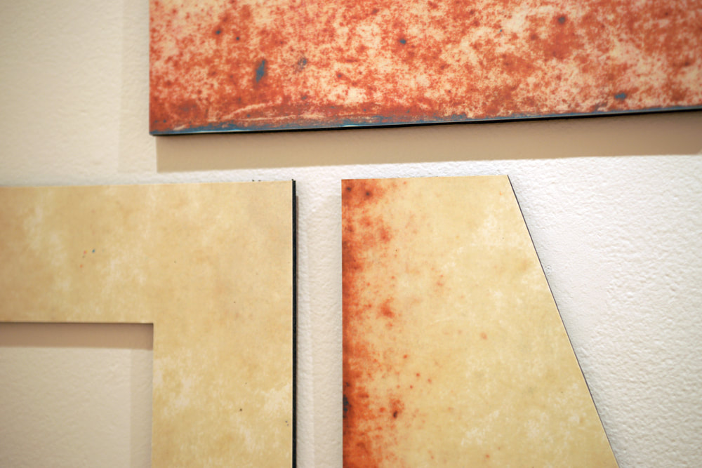
For this installation, I have created approx. 150 individual letters, around 15"w x 19" tall (1/8" "thick"). They are screenprints, mounted to black foam core, and cut out by hand. The source imagery for the screenprints, comes from "tympan" paper, which is a creamy beige, waxy paper material that is used in "dressing" or setting up, old fashioned letter presses. I have a 60 year old roll of this stuff, and the texture and translucency really seduces me. The use for the paper itself, seemingly an underdog in relation to how a letter press works, is vitally important to registration and overall quality of impression. The letter press and moveable type, first "invented" by Gutenberg in the mid 1400's gave birth to the first real information age, and is a touchstone for me, as a contemporary artist using print and printmaking media to continue the attempts at communication, however vastly different, first set into motion almost 600 years ago.
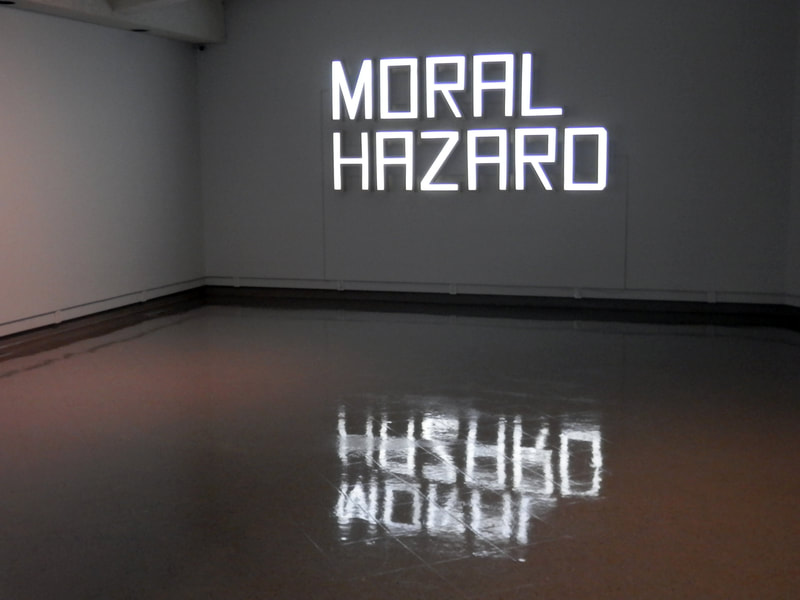
"The Conversationalist" Handmade wooden channel letters (Dunlop Sherwood Gallery Installation) 2015
The Conversationalist - Project Description
Taken from successful Sask Arts Board funding application:
The first instance of widespread, exactly repeatable Print media came through the invention of “moveable type” by Johannes Gutenberg in the mid 15th century. Printing – in and of itself – was not new, per se, but Gutenberg’s workshop thought to produce individual letters that could be configured, proofed, reconfigured if necessary, printed, and then returned to their individual drawers for use at a later date in an entirely different form. Various methods of intentional, reproducible printing had been underway for a millennium or more by the 1430’s, but it was not until this simple-but-earth-shifting change occurred that the idea of so-called “mass communication” even came to be. And it was the humblest of materials that Gutenberg first used to actuate a shift in human communication unlike anything we would see again for nearly 600 years (with the birth of the internet and widespread use of social media). Gutenberg used paper.
One could argue that with the advent of mass-production printing, generations of knowledge could now be shared and archived. As such, human beings could spend more time learning new things, advancing knowledge, and proving (or work towards proving) ideas that had not yet been finalized, rather than re-learning that which had been lost, over and over again. Without an archive of ideas and knowledge – one that could be replicated and copied, and sent to the far corners of the known world – compartmentalization and specialization of all forms of knowledge from medicine to commercial affairs could never have fully developed. Advertising one’s specialty (widely) was barely comprehensible prior to humanity’s ability to share knowledge on a “global” scale. It was in this first “information age” (the age of Printing), that branding and marketing first emerged, despite how contemporary we may assume such concepts to be.
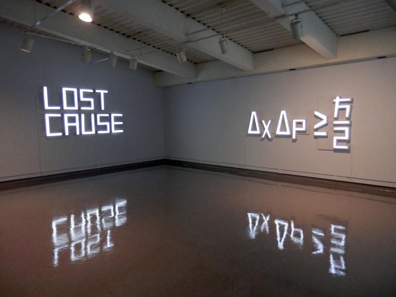
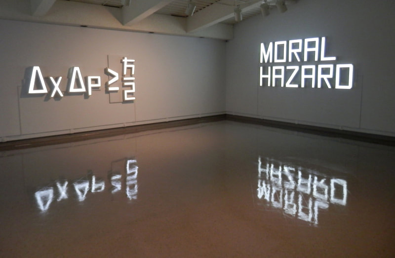
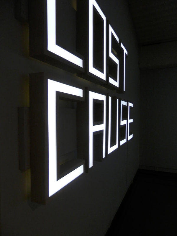
My project looks to synergies between paper, text, and light to interrogate the human drive to share information in both historical, and contemporary terms. In any present-day urban environment – any inhabited space, really – we would be hard-pressed not to find public signage of some kind: advertising every manner of specialization from auto repair to fast food, issuing instructions, warnings, or outright threats. However “fancy” or “unique” the text or fonts used, however crisp and photo-mechanical or hand-written and hastily scrawled, the words themselves are the heart of the communicative effort; they are meant to reach as many people as possible.
Light plays a functional role in almost every case; light is reflected from a source to the words we see, to our eyes, and at times, is integrated into the “design” itself, in the case of illuminated signage. For human beings, (the sun’s) light equates to growth; to food and warmth; it governs our days and the seasons, and; is sometimes a place-holder for God, if one were so inclined. I see light, conceptually, too, as an apparent-but-intangible force, that when teamed with text and paper, becomes a “place” or a “site”. This site is where I hypothesize “communication” to happen.
The 1st Sabbatical Prints (UV silkscreens) 2013-14
The 1st Sabbatical Prints - Project Description
Some or all of the work from my first sabbatical was shown widely. I had solo exhibitions at SNAP in Edmonton, Slate Fine Art Gallery in Regina, Artist Proof Gallery (Alberta Printmakers) in Calgary, and the Estevan Art Gallery and Museum. There were also group exhibitions at McMaster University, the Kyoto Municipal Museum of Art, Tokushima Art Museum, The Art Gallery of Regina, and the U of A Museums Gallery.
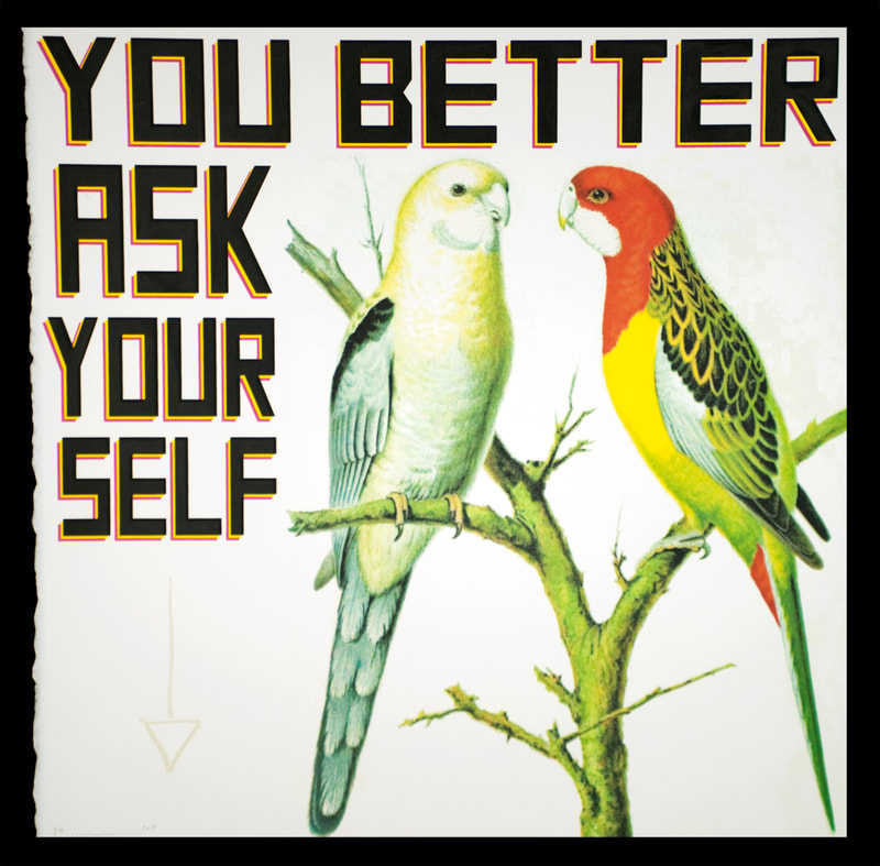
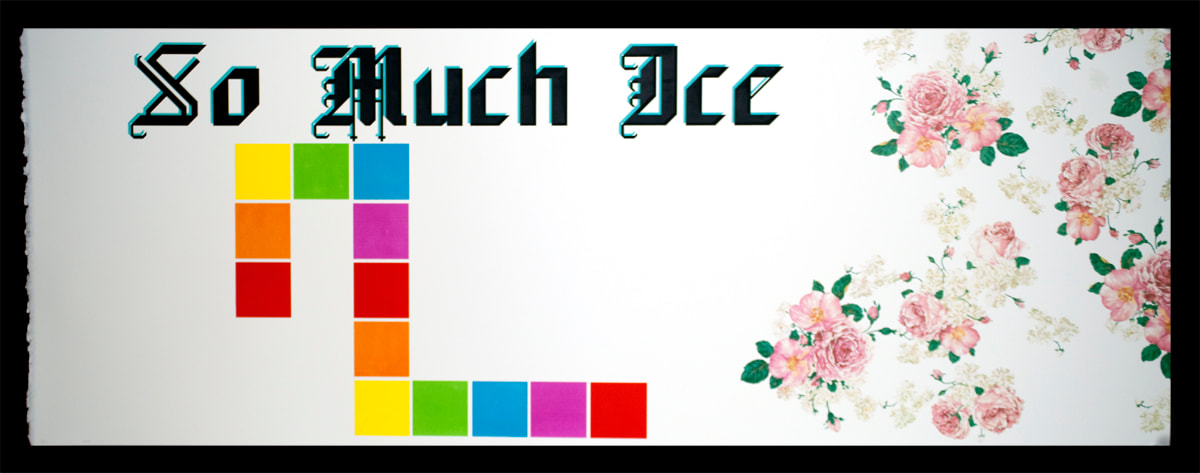
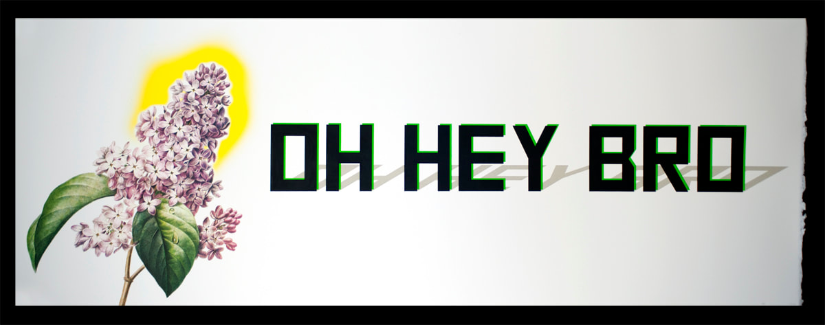
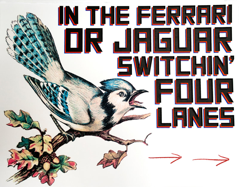
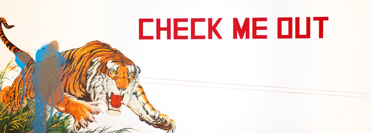
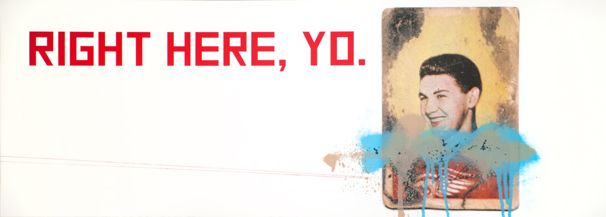
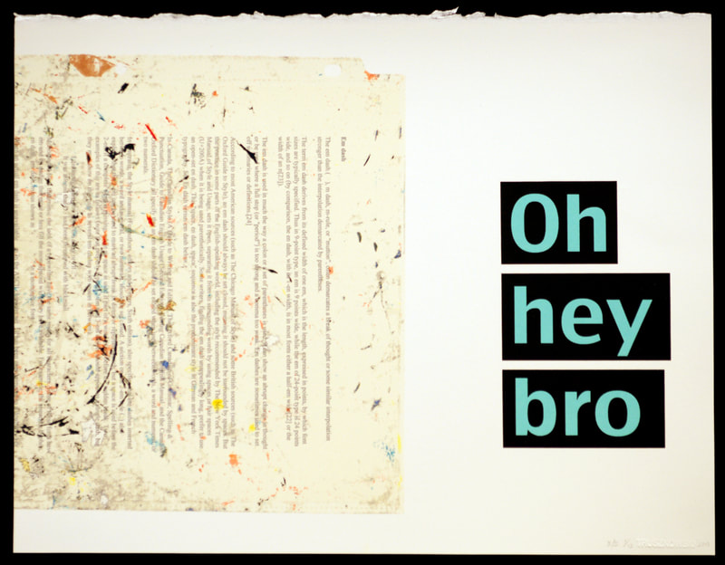
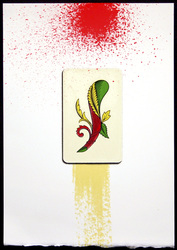
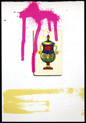
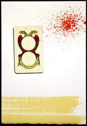
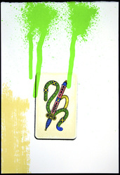
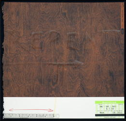
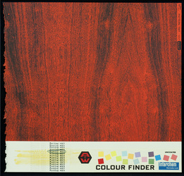
Conceptually, this work was a creative explosion based loosely on my ideas around communication, pop culture, music, commercially printed images and ephemera, and advertising culture. It integrated samples of 60-100 year-old wallpaper, 19th-century Circus posters, old hockey cards, as well as the flora and fauna of 18th and 19th century chromo-lithographs, along side rap lyrics and present-day slang. The result was a chromatically-charged peek into my own musings and imaginings around the nature of text and communication. This period of sabbatical, (one year) was possibly the most fertile creative period I had experienced in my career, up to that point.
The U of R UV Silkscreen Prints 2010-14
The U of R UV Silkscreen Prints
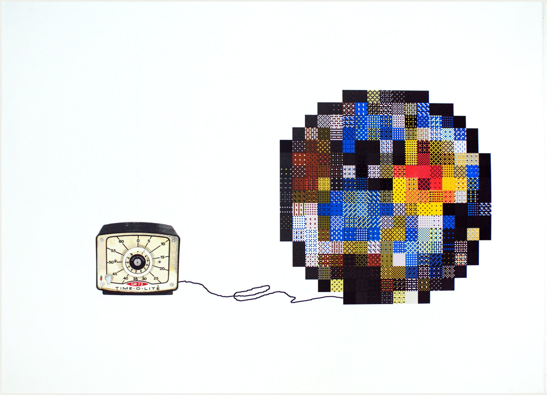
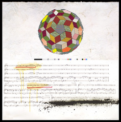
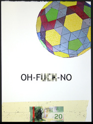
The work made during this period can be navigated – somewhat nebulously – by dividing it into four thematic categories: The Technological Reference, The Text, The Polyhedron, and The Receipt. Many of the suggestions and positions I offer up in relation to this work seep into later work, and in fact, have significance in the way in which I look at almost everything I have done, as a professional artist. Almost.
The Technological Reference
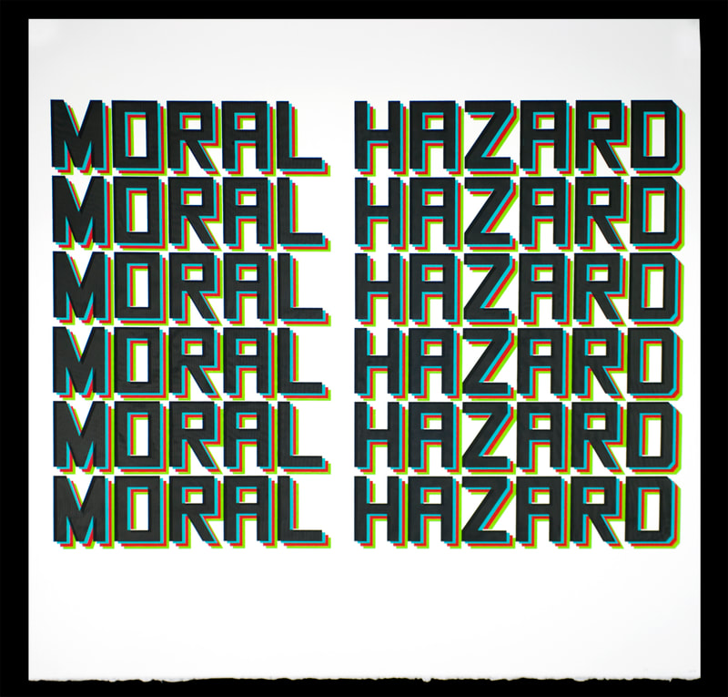
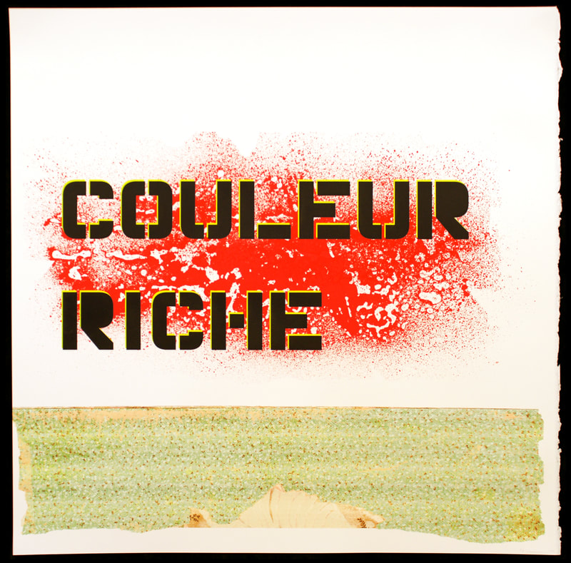
I am a Print-based artist with a deep sense of the mechanical history and importance of my technical media. As such, it is not at odds to say that my approach to Print is progressive in the sense that I don’t maintain a “historical” practice, rather, I embrace the fact that Print has always been about improving (and usually profiting from) its forward-looking trajectory. My work contains – for those who want, can, or choose to look – myriad references to aspects of the history of printed matter; discreet colours and pigments, obvious manifestations of repetition and registration, formal and compositional nods to works of past artists, craftsmen, or industrial innovators, as well as tongue-in-cheek jabs at contemporary “Photoshop culture”, and throwaway media. Notwithstanding the conflict I feel regarding the trompe l’oeil, as well as my own use of it, my current practice attempts to use the medium (typically silkscreen) in a way that no one else can, or has thought to do, combining deep reverence and contextual understanding with a kind of “throw them deuces up” cynicism and disrepect – à la Lil Wayne or Notorious B.I.G. My technical work embraces the agony and the ecstasy.
The Text
The use of text in my work is ubiquitous, and if I didn’t love making images so much, it might be the only thing I do. To say that text is easy – in the sense of its ability to make a point that trumps all other attempts at visual communication around it – is to succumb to sloth. Because text can hold centre stage, how I use it (in both conceptual and formal) ways is extremely important. Language is so highly ambiguous that we use experts to decipher rules (lawyers), build machines and software (engineers and coders), and tell us stories (actors and writers, teachers, preachers, and weathergirls); my hope is to engage this practice with equal parts Explicit and Implicit.
To use text is to engage the history of communication. To print text is to invoke synthesis.
The Polyhedron
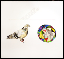
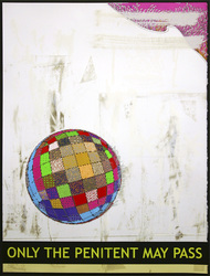
Technically mathematical in origin, the multi-sided, hyper-coloured round mass pervades much of my recent printed work. It is said that there is math in all things, which, by my experience means either looking for structure, governance, and truth, or giving up one’s sense of loneliness (or autonomy), in order to situate experience and existence. The polyhedron, then, is not too far from the Sun that gives life and orders all things, and by extension, the notion of a God, who takes things one step further. The polyhedron, in my prints, provides focus, inspires awe and respect, imparts wisdom, and, like the giant boulder in the opening sequence of Indiana Jones, will run-you-the-fuck-down, if you fail to pay it its due.
The Receipt
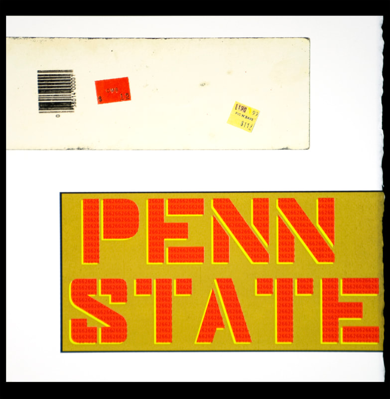
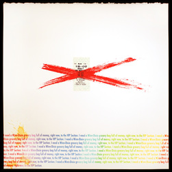
The “receipts” in my work, function literally and conceptually. Examples of receipts include bus and metro tickets, playing cards, printed music, “fancy” halftone screens, and beat-up book dust-jackets. Receipts, in this way, are evidence of reception; the physical proof of communication. From the earliest days of printing, of course, came the counterfeit reproduction, but there is no proof more powerful than that little slip of paper, or book, or whatever, that some kind of communicative transaction has taken place.
Compounding that point, or perhaps, confounding it altogether, is the fact that current Print-based practice has evolved to conceptually mirror (and indeed, predict) the world of content sharing, appropriation, mis-appropriation, and piracy. The academic world is under attack from stringent copyright regulations, and at the same time, digital locks on consumer media make it more and more difficult to understand what we “own”, in light of “what we are allowed to watch, hear, or experience”. As a Print artist, I have unparalleled access to images, content, and methods of production, but as the world wrestles with debates over ownership and (intellectual) property, I also have a responsibility to re-examine my own role in defining the power/authority paradigm.
Intaglio prints 2007-2009
UV silkscreen prints 2006-2008
Ether and White Sky series 2004-2006
Silkscreen paintings series 2002-2004
Multi-media prints 1999-2000
